
No products in the cart.
Blog
Date Window Alignment Guide
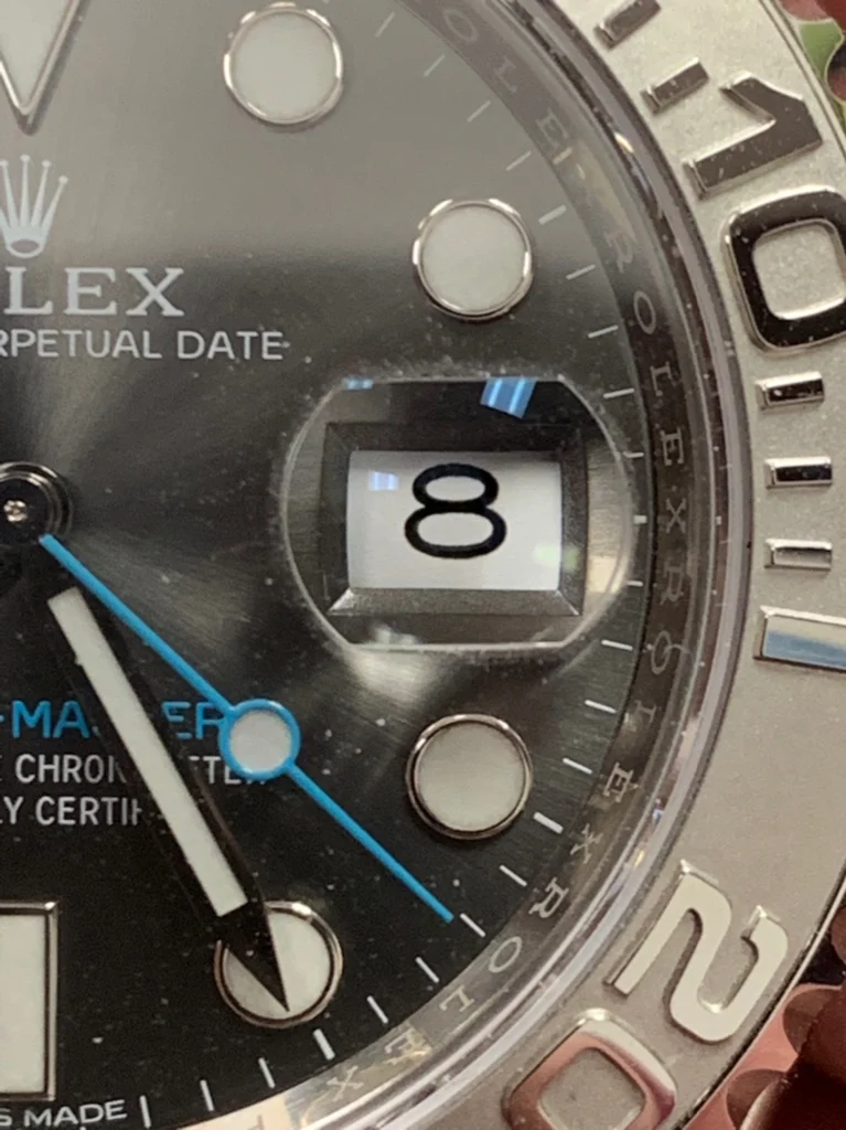
In watch forums, the strangest fights start over one thing: the date window. Not the movement. Not the bracelet. Not even who claims the best “factory.” It’s usually a crooked number that sets people off—because once you spot it, you can’t unsee it.
And most people don’t notice the problem at first. They only catch it when someone else points it out in QC photos. After that, their brain flags every glance at the dial. That’s why buyers who’ve done this more than once scrutinize date alignment early, especially on watches that show the date every day.
Why date alignment keeps showing up in QC reviews
Most dial details fade into the background after a few days. You stop thinking about the hands, the markers, even the dial finish. The date is different.
If your watch has a date complication—Rolex-style Datejust/Submariner Date, GMT-Master II, Day-Date, Sky-Dweller, or similar designs—your eyes go there automatically. That’s the whole point of the feature. The downside is that any misalignment feels louder than it “should,” because it sits right where you check constantly.
So the issue isn’t whether the movement is “right.” It’s whether the date display reads cleanly at a glance.
What “good” alignment looks like in normal viewing
People overthink this. They zoom until the dial turns into a grid of pixels and then argue about tiny offsets that don’t matter in real life. The basic test is way simpler.
The number should appear naturally centered inside the window. Nothing should look like it’s leaning into one side. Nothing should feel squeezed against the frame. When it’s right, your brain accepts it immediately, and you don’t have to “solve” what you’re seeing.
It should look balanced, not crowded. And it shouldn’t look like the date is touching an edge.
Why some digits look “wrong” even when the setup is fine
First-time buyers get tripped up here. Not every date will look identical, and that’s normal. The “1” doesn’t visually behave like the “8.” The “11” doesn’t sit the same way as “23.” “28” can look different from “6.”
Those differences come from how the digits are shaped and how they visually occupy space within the window. Because of that, experienced buyers don’t judge alignment from a single date position. One snapshot can mislead you. Multiple positions tell you whether you’re seeing a real pattern or just a digit-specific optical quirk.
The QC blunder that creates most “it arrived wrong” complaints
Here’s the usual story. Someone approves QC photos after checking the date when the watch shows, say, 23. It looks fine. Approval gets sent. The watch arrives. Then, a few days later, they notice the next date position looks off—maybe the 8. After that come the 18, then the 28. At that point, it feels like the watch is “broken,” even though the QC review only covered one moment.
That’s why buyers who do this well try to review several date positions whenever they can. They focus on the ones that tend to reveal alignment behavior fastest, like:
- Single-digit dates
- Double-digit dates
- Dates ending in 8
- Dates ending in 1
High, low, left, right: the four patterns you’ll actually see
Most date-window problems fall into a handful of buckets. The date can sit too high, too low, too far left, or too far right.
Sometimes you catch it instantly. Other times it’s subtle enough that you stare at the number and still miss it.
Try a different check. Stop fixating on the digit and look at the empty space around it. Does one side have noticeably tighter spacing? Does the balance look uneven? That’s usually where the misalignment becomes obvious.
Cyclops magnification and why Datejust/Submariner buyers scrutinize more
Some models add a cyclops magnifier over the date. That changes the whole perception game.
With the cyclops, the date is magnified, so small alignment flaws show up larger than they do on watches without magnification. A window that looks acceptable in a standard view can suddenly become the first thing your eye latches onto through the extra glass.
This is one reason Datejust and Submariner buyers often inspect date windows more aggressively than buyers of models without a cyclops.
Factories aren’t frozen in time
It’s tempting to say one factory is always better. Sometimes that’s true for a stretch. But performance changes over time—batch quality, sourcing, or process tweaks can shift results.
A factory that produced great date alignment recently might deliver weaker examples later. Another shop might improve quietly without much chatter. That’s why experienced buyers care more about current QC photos than old reputation or older forum claims.
If date alignment is what you’re worried about, newer examples matter more than history.
When criticism turns into pixel-hunting
Spending an hour zooming into QC images isn’t the same thing as evaluating a watch. At some point you’re not judging wearability—you’re judging a screen.
Then every date looks flawed, because real manufacturing always has small variations. Even genuine high-end watches can show minor differences depending on alignment and how the date sits at that moment.
The goal isn’t to find microscopic imperfections. The goal is to spot issues you’ll actually notice during daily wrist checks.
The date window test that saves people from over-worrying
Do this before you get lost in zoom tools. Look at the watch the way you’d actually see it on your wrist. No enlargement. No pixel-level scrutiny. Just the normal viewing angle and scale.
Then ask one simple question: does the date immediately look strange? If the answer is no, you’re probably fine. If the answer is yes, then it’s worth investigating further.
This approach cuts down a lot of unnecessary anxiety because it forces you to judge what your eyes will likely do in real use.
What experienced buyers focus on instead of perfection
After a while, buyers stop chasing “no flaws” and start looking for balance. They ask whether the date looks centered. They check whether it appears natural at a glance. They watch for anything that pulls attention the wrong way.
Most importantly, they try to predict whether they’d notice the issue during normal wear. The watch isn’t going to sit under a microscope. It’s going to sit on a wrist, under changing light, with your attention moving on and off it all day.
Bottom line
Date alignment gets discussed so much because it’s visible and you check it constantly. It’s also one of the most noticeable parts of the wider QC process. The good news is that you don’t need a spreadsheet or a magnifier to make a sensible call.
Check multiple date positions. Pay attention to how the spacing looks around the numbers. Don’t judge from one date alone. And don’t zoom until you’re arguing about pixels.
The real target is simple: a date window that looks natural the moment you glance at the watch—because once it arrives, that’s exactly how you’ll be using it.