No products in the cart.
Official 1:1 Super Clone Category
Explorer
Rolex Explorer Super Clone Watches
The Explorer is a hard watch to fake well because there’s nowhere to distract you.
No rotating bezel. No cyclops. No polished center links. No busy dial.
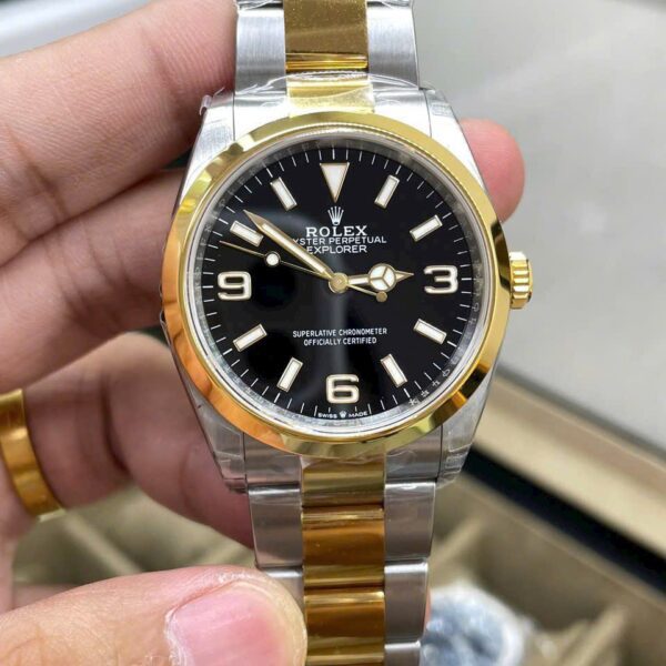
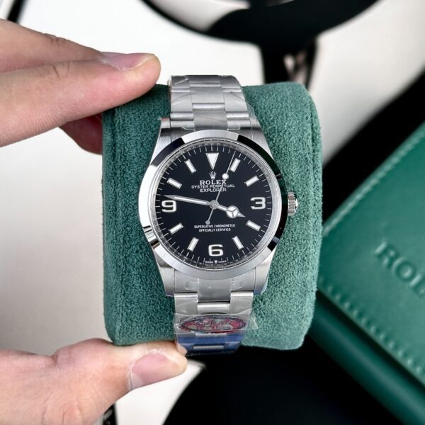
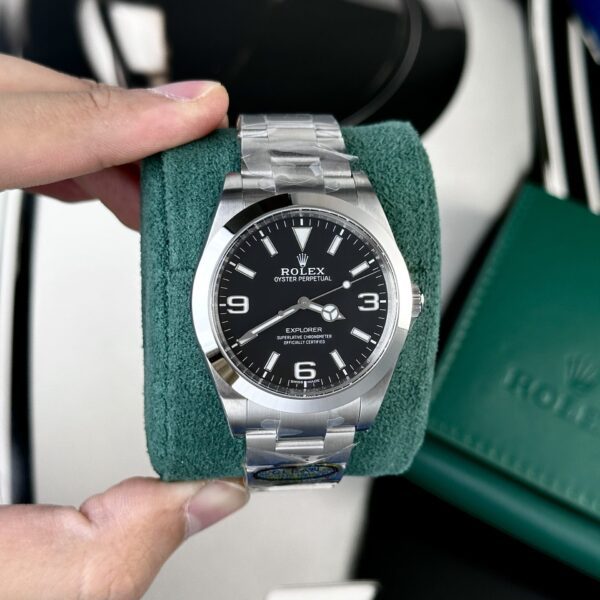
What you get is a black dial, a smooth bezel, three Arabic numerals, and a steel bracelet. That’s the whole idea.
And that simplicity is exactly why small mistakes stand out. A marker that’s slightly off, a mid-case that’s too thick, numerals that look heavy, or a bracelet that feels mismatched to the case can throw off the entire watch.
The Explorer looks basic.
It isn’t easy to execute.
The 3, 6 and 9 Carry the Dial
Remove the Arabic numerals and the Explorer stops looking like an Explorer.
The 3, 6, and 9 aren’t just decoration. They set the balance of the dial and give it its character.
If they’re too fat, too stark, placed a little oddly, or filled unevenly with lume, your eye goes straight to them. Not because the flaw is dramatic. Because there isn’t much else competing for attention.
So I wouldn’t start by zooming in on the coronet or reading the tiny text.
Start wider.
Look at the whole dial.
Does the 3 sit naturally across from the 9? Does the 6 land where it should above the minute track? Do the numerals feel in step with the rectangular hour markers?
Then check the hands. On a crowded watch, slightly awkward hand length can disappear into the rest of the dial. Here, it can’t.
Space matters.
When the spacing is right, the watch feels settled. When it isn’t, the dial starts to feel cramped, and you notice it even if you can’t explain it right away.
36mm, 39mm, and the Limits of the Spec Sheet
This is where the Explorer changes character most.
A 36mm Explorer and a 39mm Explorer can look pretty similar in a listing photo. On the wrist, they don’t.
The 36mm case feels tighter and a little more restrained, with more visual weight pushed toward the bracelet. That’s the older Explorer mood a lot of people are after.
Step up to 39mm and the watch breathes more. You see more dial, the numerals have extra room around them, and the whole thing reads more like a modern sports Rolex without getting oversized.
The Explorer 214270 black-dial 39mm is a good example of that larger layout.
I wouldn’t pick between them by diameter alone.
Check the lug-to-lug span. Check how broad the dial looks inside the bezel. Then think about your own wrist, not just the number on paper.
Some watches wear smaller once they’re actually on the arm. The Explorer tends to do that because the smooth bezel and black dial don’t shout for attention.
That’s why people who usually avoid 36mm sometimes end up liking the smaller Explorer, and people used to 40 or 41mm watches can wear the older 39mm without it feeling big or small.
The measurements don’t tell the full story.
The Smooth Bezel Exposes Every Shortcut
A Submariner bezel gives you a lot to look at: markings, insert, reflections, scale.
The Explorer gives you a polished steel ring.
That’s all.
So the bezel shape has to be right. It should frame the dial without looking chunky or flat, and the transition into the case should feel clean. The polish also needs to sit well next to the brushed surfaces instead of making the watch look overdone.
Photos only tell you so much here.
Move the watch.
Tilt it.
Watch how the bezel takes light, then look at the case from the side.
The Explorer shouldn’t feel fragile, but it also shouldn’t look like a generic steel case with the right dial dropped in afterward.
The lugs matter just as much. On a plain design, their shape and taper into the bracelet have a big effect on whether the watch looks balanced or clumsy.
You won’t see that in a product title.
You’ll see it every time you wear it.
A Black Dial Still Has Plenty to Get Wrong
People hear black dial and assume simple.
Not really.
The Explorer dial lives on contrast: white markers against black, bright hands against black, luminous 3, 6, and 9 against black.
If the printing is weak or the lume application looks uneven, it shows immediately.
Start in daylight.
Then look again in lower light.
The markers and numerals should feel like they belong to the same dial, not like separate parts installed without much care.
Lume matters too, but I wouldn’t obsess over one photo where a marker looks slightly brighter than the others.
Camera exposure does strange things.
What matters is the dial making sense as a whole. The Explorer was built around legibility, and the current genuine models still rely on that black dial with luminous 3, 6, and 9 numerals as the visual signature.
You should get that instantly.
If the hands disappear and it takes too long to read the time, the watch missed the point.
The Bracelet Changes the Way the Case Reads
Some watches are happy on anything.
The Explorer isn’t really one of them.
The Oyster bracelet is part of the design, not an accessory you judge separately. Its width, the first links, and the way it leaves the lugs all affect how the case appears on the wrist.
On the smaller Explorer, a bad bracelet can make the head look undersized. On the larger one, a bracelet that’s too narrow can make the case seem broader than it should.
That’s why I look at the watch as one object instead of splitting it into neat categories like case quality over here and bracelet quality over there.
Put it on.
Does the bracelet flow naturally from the case? Does the watch stay centered? Does the clasp feel in proportion?
That’s the stuff that counts, and a flat product photo usually won’t answer it well.
Don’t Reduce the Explorer to a Spec Comparison
This is a model that invites overthinking.
You can lose hours comparing factory names, movement labels, tiny dial print, and microscopic measurements.
Some of that matters.
It just isn’t where I’d start.
First figure out which Explorer shape you want.
Smaller and more traditional?
Larger and more current-looking?
Steel only?
The two-tone 36mm version?
Then judge the watch as a whole.
This isn’t a GMT where the extra hand changes how you use it. It isn’t a Daytona with a chronograph dominating the dial.
The Explorer tells the time.
That’s part of its appeal.
There’s less to fiddle with and more to just wear. Oddly enough, that puts more pressure on the basics.
Case.
Dial.
Hands.
Numerals.
Bracelet.
If those five parts work together, the watch is already doing most of what an Explorer needs to do.
Why People End Up Wearing the Explorer More Than They Expected
The Explorer can look almost too plain online, especially next to a Pepsi GMT or a Daytona.
Then you wear one.
There’s no bezel color to think about, no polished center links collecting fingerprints, no date to reset after the watch has been sitting for a few days.
You pick it up and put it on.
That’s the appeal.
The black dial works with almost anything. The smooth bezel keeps the watch visually quiet. The Oyster bracelet gives it enough sports-watch presence without pushing it too far.
From a distance it can look a little dressier than it really is.
Up close, it reads more utilitarian.
That’s a useful mix, and it’s why I wouldn’t try to make the Explorer sound more exciting than it is.
The restraint isn’t a flaw to fix.
It is the watch.
What I’d Check Before Buying an Explorer Super Clone
I’d begin with one full photo of the watch.
No zoom.
Does it actually look like an Explorer?
That sounds obvious, but it’s the right first question.
Check the dial balance. Then the 3, 6, and 9. Then the relationship between the smooth bezel and the dial.
After that, look at the case shape and the way the lugs meet the Oyster bracelet.
Only then would I move in closer.
The Explorer rewards the big, simple things being done right.
It doesn’t need a long list of flashy features.
It needs proportion.
If you’re comparing other Rolex families too, the full Rolex super clone collection lets you move back to the broader range without turning an Explorer page into a catalog of everything else.
For the Explorer itself, I’d keep it simple.
Pick the size you really like.
Look at the watch as one shape.
Then inspect the details.
Important: Watches offered by SuperCloneReps are independent reproductions. They are not manufactured, sponsored, approved or endorsed by Rolex SA and should not be represented or resold as authentic Rolex watches.