No products in the cart.
Official 1:1 Super Clone Category
Explorer II
Rolex Explorer II Super Clone Watches
The Explorer II has always sat a little apart from the rest of Rolex’s sports lineup. It has the steel bezel and second-time-zone display you’d expect from a tool watch, yet it doesn’t wear or read like a Submariner or GMT-Master II. The fixed bezel gives it a flatter, more straightforward face, and the overall design avoids the polished flash of other professional models.
That’s a big part of its appeal. An Explorer II looks purposeful without announcing itself from across the room.
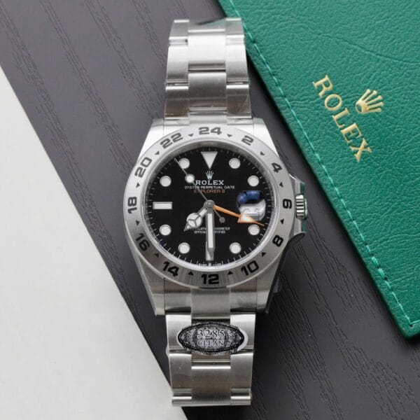
The current Explorer II 226570 uses a 42mm case, a fixed 24-hour bezel, and the distinctive orange GMT hand. There’s no rotating ceramic insert, no bright bezel color, and very little decoration to pull attention away from the basics. Its character comes from case proportions, the open dial layout, and the sharpness of the small details.
On an Explorer II super clone, that restraint puts every mistake in plain view. A marker with the wrong shape, heavy bezel engraving, a date window sitting a little too high—there isn’t much on the watch to distract from it.
The Explorer II 226570 Comes Down to Proportion
The 226570 is a large watch, but it shouldn’t come across as clumsy. At 42mm, it has a broad dial and plenty of visual space. The hands, indices, bezel, and rehaut all need to sit in a relationship that feels settled rather than crowded or stretched out.
Start with the bezel. It should frame the dial instead of taking it over. The engraved 24-hour numerals need clean edges and even fill; overly dark paint or thick engraving gives the bezel a blunt look very quickly. Since it doesn’t rotate, the bezel is part of the watch’s permanent face. You keep seeing it.
Crown guards deserve a look too. Their curves, along with the line where the case meets the bracelet, shape how the watch reads from the side. A blocky case-to-bracelet transition can make an otherwise convincing dial feel attached to the wrong watch.
The orange 24-hour hand is another detail people notice immediately, especially against the white Polar dial. Its shade needs to look right, but length and placement matter just as much. If it reaches awkwardly toward the minute track or sits oddly in the center stack, your eye keeps returning to it.
A good Explorer II looks balanced at arm’s length. Magnification has its place, but buyers lean on close-up photos too hard when the overall proportions are already telling them something is off.
Polar Dial or Black Dial?
Most Explorer II buyers land on the same decision: white Polar dial or black dial.
The Polar version is the more recognizable one. White makes the black marker surrounds, minute track, hands, and orange GMT pointer jump out at once. It’s also unforgiving. Weak printing, uneven marker finishing, or a date aperture that isn’t properly centered tends to show up faster on a pale dial than on a dark one.
Photos can make that even harsher. On a white surface, a slightly soft printed minute track or poor contrast around the hands is hard to miss once you start zooming in. The dial has nowhere to hide.
The black dial is quieter and a little more familiar within the professional Rolex range. The orange hand still adds color, though the overall effect is less conspicuous. It’s the version for someone who likes the Explorer II layout but doesn’t want the dial doing all the talking.
There’s no objectively better pick. The Polar dial pushes the Explorer II’s oddness—in a good way—while the black dial keeps the watch more understated.
What to Check During Explorer II QC
Explorer II QC rarely comes down to one dramatic flaw. More often, it’s a handful of small things that start adding up once you look at the watch as a whole.
The fixed bezel is the obvious first stop. Check whether the numerals are spaced consistently around it and whether the fill looks even. It shouldn’t appear excessively dark, shallow, or patchy from one number to the next. Since there’s no ceramic insert or color scheme competing for attention, bad engraving stands out.
Then move to the dial. Hour markers should sit cleanly around the minute track, without one looking noticeably closer to the edge than the rest. On a Polar dial, the black surrounds need crisp definition against the white background. The GMT hand should clear the markers properly and point naturally toward the 24-hour scale.
The date deserves more than a quick glance. Look for a numeral that sits reasonably centered in the window and looks natural under the Cyclops. A date pushed toward one side can be visible even in ordinary wrist shots, especially when the rest of the dial is as sparse as this one.
Bracelet fit changes the feel of the whole package. The Explorer II has a substantial case, so too much play where the end links meet the lugs makes it feel less solid than it should. Edited product photos don’t always show that kind of fit very well.
Explorer II Movement and GMT Function
The modern Explorer II is mechanically close to the GMT-Master II because both are built around a second-time-zone display. A movement code in a specification gives you a starting point. It doesn’t tell you much about the crown action, hand setting, or date change you’ll actually deal with.
Versions made to reproduce the modern GMT setup should allow independent adjustment of the local-hour hand. You move it forward or backward without resetting the whole watch, while the 24-hour hand stays on a reference time. That’s the useful part of the arrangement: local time changes, and the second zone remains visible.
Factory and batch differences still show up in the details. On an individual watch, pay attention to how the crown engages, whether the hands advance cleanly, and how the date behaves as it changes. Two examples carrying the same movement description can feel noticeably different at the crown.
For a deeper explanation of the mechanism, see our 3285 clone movement guide.
Explorer II vs GMT-Master II
The Explorer II and GMT-Master II both show a second time zone, but they have very different personalities on the wrist.
The GMT-Master II is built around a rotating bezel, polished details, and instantly recognizable color combinations such as Pepsi, Batman, and Sprite. It’s compact-looking, more decorative, and designed to draw the eye to the bezel.
The Explorer II goes the other direction. Its bezel is fixed steel, its case is larger, and the design sits closer to a traditional tool watch. Fewer polished surfaces and less color leave the dial layout and orange hand doing most of the work.
The choice is usually less about the GMT function than the kind of watch you want to wear. Go with the GMT-Master II if the compact, colorful GMT look is what you’re after. The Explorer II suits a larger steel sports watch with a simpler face and less visual noise.
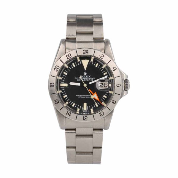
The Older Explorer II 1655 Has a Completely Different Look
The vintage Explorer II 1655 gets grouped with modern Explorer II models because of the name, but visually it has very little in common with a 226570.
The 1655 uses a smaller vintage-style case, a different dial arrangement, and the famous oversized orange 24-hour hand. Modern 226570 models are cleaner, larger, and easier to read at a glance. They share the Explorer II name, not the same visual language.
That’s probably the wrong frame for comparing them anyway. An Explorer II super clone should be judged against the reference it is trying to reproduce. A detail that works on a 226570 can be completely wrong on a vintage-style 1655, from the case profile to the dial layout and hand proportions.
Reference-specific comparison is far more useful than treating every Explorer II as the same watch.
Why the Explorer II Is Worth Looking at Separately
The Explorer II gets less attention than the Submariner, Daytona, or GMT-Master II. For someone who wants a Rolex sports design that doesn’t look like the default choice, that can be the point.
The Polar dial in particular is hard to confuse with another modern Rolex. Even from a distance, the white dial, black surrounds, fixed steel bezel, and orange hand give it its own identity.
Basic execution carries a lot of weight here. Case shape, bezel engraving, date alignment, dial printing, and the orange hand need to work together. There are fewer decorative details available to cover up a weak one.
If you’re comparing Explorer models more broadly, you can also browse our Rolex Explorer super clone collection. The Explorer I is smaller and much simpler, while the Explorer II adds the larger case, date display, and second time-zone function.
For the Explorer II itself, start with the dial you prefer. Then compare the details on the individual watch instead of choosing on factory name alone.
-
 Rolex Super Clone
Rolex Explorer II 1655 “Steve McQueen” Vintage Handcrafted Super Clone Super Clone
$1,200.00 -