No products in the cart.
Official 1:1 Super Clone Category
Oyster Perpetual
Rolex Oyster Perpetual Super Clone Watches
The Oyster Perpetual is one of the plainest watches in the Rolex lineup, which makes it surprisingly unforgiving. There’s nowhere for a bad proportion to hide.
No rotating bezel, date window, Cyclops, or chronograph subdials pull your eye away from the fundamentals. You get a smooth bezel, three hands, a clean dial, and an Oyster bracelet. On a busier sports model, a slightly heavy bezel or a bracelet that meets the case awkwardly might disappear into the rest of the design. Here, it sits in full view.
A slightly weak dial color, uneven marker placement, or an end link that doesn’t sit naturally against the case changes the watch faster than buyers expect. The design is simple, but it isn’t basic.
Size and dial also change its character more than they do on many Rolex models. A 36mm silver-dial Oyster Perpetual feels restrained and traditional. A 41mm Celebration dial or bright green version has a much louder visual presence despite using the same broad layout. Pick the actual reference, size, and dial first; deciding that you want “an Oyster Perpetual” isn’t enough.
36mm or 41mm?
Size is the first decision worth making, before you get lost in dial photos. The 36mm Oyster Perpetual has compact proportions: the dial doesn’t dominate the wrist, and the connection between case and bracelet feels tight. It has proportions closer to the smaller, more traditional Rolex sizing than the larger modern sports-watch look.
The 41mm version carries far more visual weight. Four millimeters sounds minor on a spec sheet, yet the added dial area changes the whole thing. The hour markers sit farther apart, the smooth bezel frames a broader field of color, and the bracelet has to hold up a larger case without looking too narrow.
A 41mm replica can’t just be a blown-up 36mm. Hand length, marker position, bezel thickness, and the shape of the case all have to make sense at that scale. Get those relationships wrong and the center of the dial looks empty, or the outer edge looks thick and crowded. A good 41mm still reads as clean rather than stretched.
The 36mm has the reverse problem. A bezel that carries a little too much metal, or markers placed too close to the center, can make the dial feel cramped. Judge each size on its own terms. They share a name and a layout, not identical proportions.
126000 vs 124300
The 126000 and 124300 are the references buyers see most often among modern Oyster Perpetual replicas. The 126000 is the 36mm format; the 124300 is the larger 41mm version, reproduced in a broad range of dial colors.
They share the same design language, but QC needs to be reference-specific. On a 126000, the bezel, dial, and bracelet sit in a compact visual cluster. Small alignment errors feel concentrated. A slightly tilted marker can pull the whole dial out of balance because there isn’t much empty space around it.
The 124300 gives you more open dial surface. Short-looking hands and poorly spaced indices jump out against it, particularly in bright colors. Compare a replica with photos of the exact reference, not a random Oyster Perpetual in roughly the same color. The details are too exposed for that shortcut.
Dial Color Does Most of the Visual Work
Few Rolex models lean on dial color as heavily as the Oyster Perpetual. The case is restrained, the bezel is smooth, and the bracelet is familiar. Most of the watch’s personality comes from the dial.
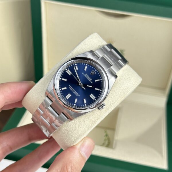
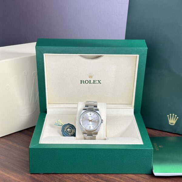
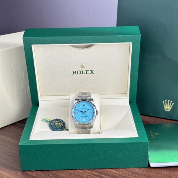
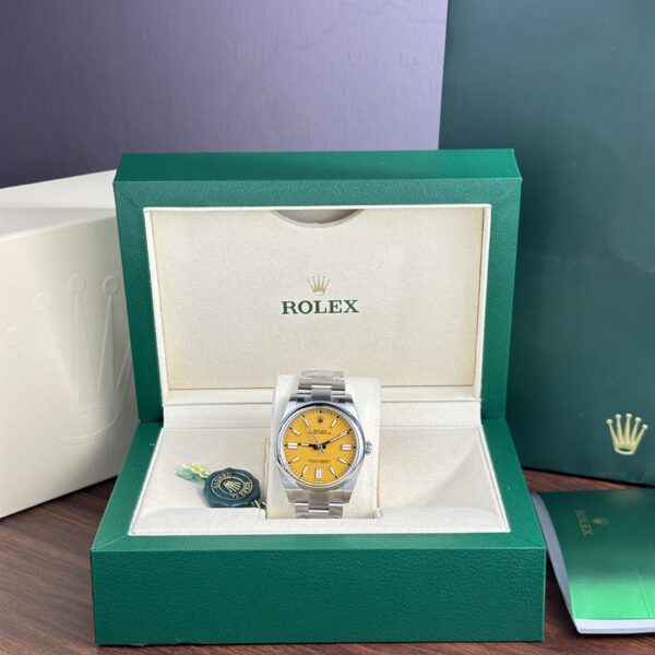
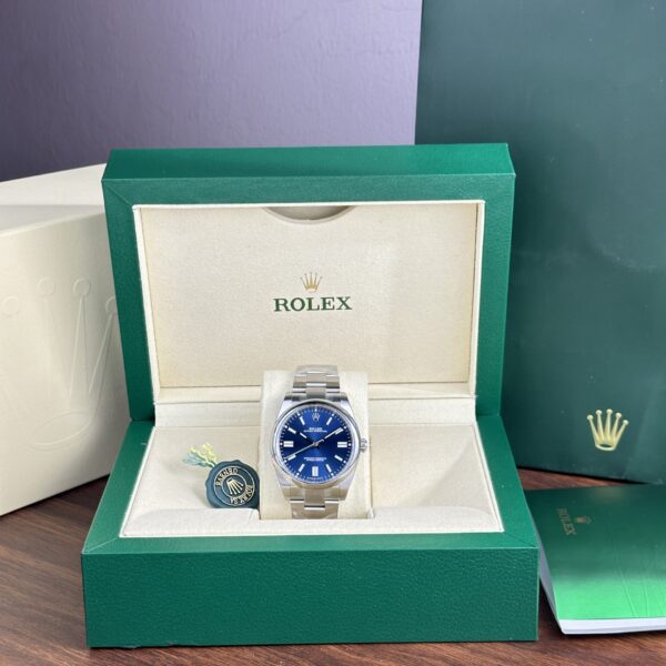
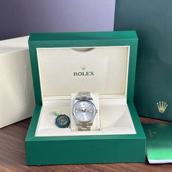
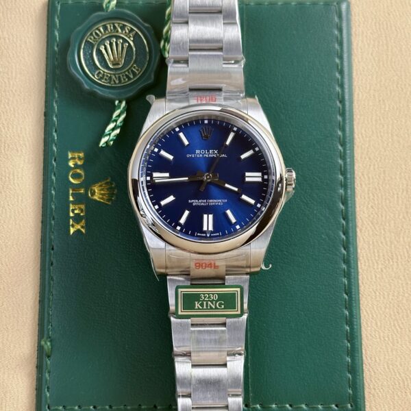
Blue, green, silver, black, yellow, lavender, turquoise-style colors, and Celebration-style dials can make two watches with the same case size seem unrelated. That range is part of the appeal, but it makes dial accuracy harder to judge from sales photos.
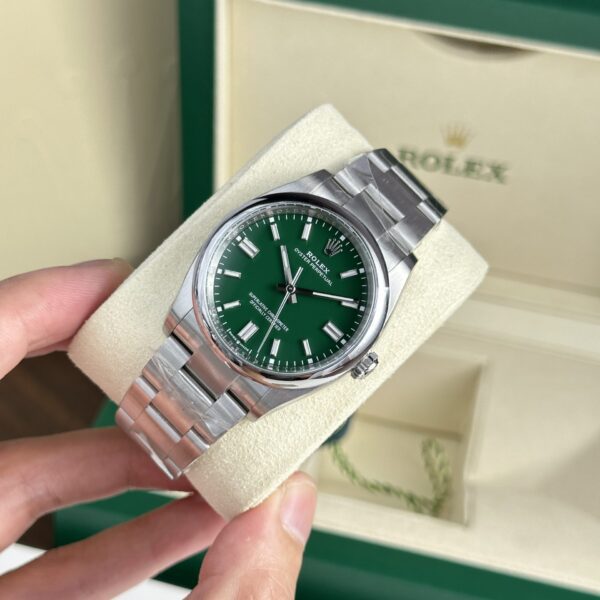
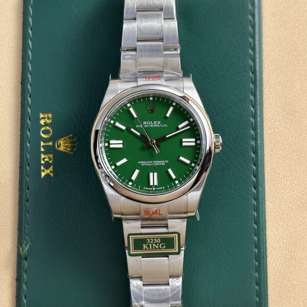
A color that looks right in one image may be too dark, too saturated, or too pale in another. Camera white balance adds another layer of confusion. Green is the obvious example: under one light it can look deep and muted, then much brighter in the next photo. Lavender and pale dials are even fussier, since a small shift in warmth is easy to notice.
I would not approve or reject a dial from one heavily edited product photograph. Look for several images in different lighting, including shots where the dial is not facing the camera perfectly. Those tend to show how the color actually behaves.
Celebration Dials Need a Different Kind of QC
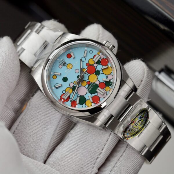
The Celebration-style Oyster Perpetual is busier than the solid-color versions, so inspecting it requires a different order of attention. With a plain blue or silver dial, marker alignment and color consistency make the first impression. The Celebration dial gives your eye bubble shapes, outlines, spacing, and several colors at once.
Start with the whole pattern rather than magnifying one bubble at a time. The shapes should look deliberately placed, and the colors should sit together without one becoming oddly dominant. A replica may capture the general idea while still looking wrong because individual bubbles are too large, their outlines are heavy, or their spacing doesn’t match the reference closely enough.
Printing around the hour markers needs to remain clean as well. Busy dials can cover minor flaws for a second, but once one element looks misplaced, your eye keeps going back to it. If the pattern feels wrong from normal viewing distance, macro photography won’t save it.
The Smooth Bezel Is More Important Than It Looks
The smooth bezel seems like the least complicated part of an Oyster Perpetual. There’s no engraving and no ceramic insert, so its profile and polish are doing all the visual work.
It should frame the dial without looking overly thick. Too much metal around the dial makes the watch feel smaller than it should; too little makes the dial appear oversized. This is especially apparent when you compare 36mm and 41mm references side by side, where a bezel proportion that works on one can look strange on the other.
Look at the reflections, too. Soft edges, uneven polish, or finishing that appears dull beside the case will drag down an otherwise good dial. It’s a small component, visually speaking, but stripped-back designs make small components conspicuous.
What to Check During Oyster Perpetual QC
Start at normal image size. Don’t zoom in immediately. Look at the markers as a group and see if one sits noticeably higher, lower, or rotated compared with the others. The dial layout is so spare that inconsistent placement is easy to catch before you start studying print quality.
Then check the coronet beneath the 12 o’clock marker. It should sit naturally in the space available, without looking crooked or unusually close to the surrounding text. Move to the hands after that: their lengths should fit the dial size, and the second hand should reach the minute track in a way that looks natural.
Next comes the bezel and case. The bezel needs to appear even all the way around the dial. Watch the lugs as well. They shouldn’t look overly thick or square, and the case should flow into the bracelet instead of ending abruptly at the end links.
End-link fit is an easy place to spot trouble. Obvious gaps between bracelet and case look unfinished, even in an otherwise clean set of photos. Finally, get a side view. The Oyster Perpetual is not a complicated case, so excessive thickness or an awkward caseback becomes obvious once the dial is no longer doing all the talking.
Bracelet Quality Changes the Whole Watch
People overlook the Oyster bracelet during QC because it’s so familiar. That’s a mistake. On the Oyster Perpetual, it makes up a large part of the watch’s appearance because there are so few competing design elements.
The links should articulate smoothly without looking unusually loose. Brushed surfaces need consistent finishing from link to link, and the clasp should close securely while sitting naturally against the wrist rather than looking bulky beside the bracelet.
Pay close attention to the end links. A small gap may be easy to ignore in a tight product photo, but it changes the case-and-bracelet connection on the wrist. The watch should read as one continuous object, not a case with a bracelet fitted afterward.
Movement Codes Only Tell Part of the Story
Modern Oyster Perpetual replicas are commonly sold with movements meant to imitate the layout or behavior of Rolex’s 3230 generation. The movement name is useful information, just not a complete quality judgment.
There’s no date complication here. Daily interaction comes down to winding, setting the time, crown feel, hand movement, and how consistently the watch runs. Put more attention on those moments than on a movement code in a listing.
The crown should move through its positions clearly, without feeling unusually loose or rough. While setting the time, the hands should respond predictably rather than lagging or behaving inconsistently. Two watches described with the same movement can still feel quite different at the crown, especially across batches or factories. Buyers lean on movement codes too hard with this model.
Oyster Perpetual vs Datejust
The Oyster Perpetual and Datejust share enough Rolex design language that buyers regularly compare them, but they feel different on the wrist.
The Oyster Perpetual is cleaner: no date window, no Cyclops, and usually no fluted bezel or Jubilee bracelet reshaping the watch’s silhouette. It has a simpler, sportier look.
The Datejust gives you more variety in bezel, bracelet, dial, and date presentation. Fluted-bezel and Jubilee configurations in particular feel more decorative.
They’re different solutions to the same general Rolex design language. The difference really comes down to whether you prefer the cleaner three-hand layout or the additional detail of the Datejust.
Factory Names Matter Less Than the Dial in Front of You
Starting an Oyster Perpetual search with a factory name is tempting. It can narrow the field, but the individual watch deserves more attention on this model.
Dial batches change. A factory that handles one color well may be less convincing with another, and marker placement, bezel proportions, bracelet fit, and crown feel can vary between watches from the same source. The better question is which specific reference looks right in the available QC images.
I’d start with size and dial, then inspect the execution of that exact watch. A well-known factory name won’t fix a color you dislike or a marker that is visibly out of position.
Start With Size, Then the Dial
Decide between 36mm and 41mm before working through every available dial. Then choose the color, because it changes the personality of the watch more than nearly anything else. A silver 36mm and a bright 41mm Celebration dial may as well be separate propositions.
From there, compare the specific reference rather than treating the Oyster Perpetual family as one watch. Check dial balance, marker alignment, bezel thickness, bracelet fit, crown action, and the side profile. The plain design makes every one of those decisions visible.
It is one of Rolex’s simplest designs, and reproducing it well is not simple. Once the proportions, dial, and bracelet work together, the Oyster Perpetual has an easy, settled look. Small mistakes show for exactly the same reason.
-
 Rolex Super Clone
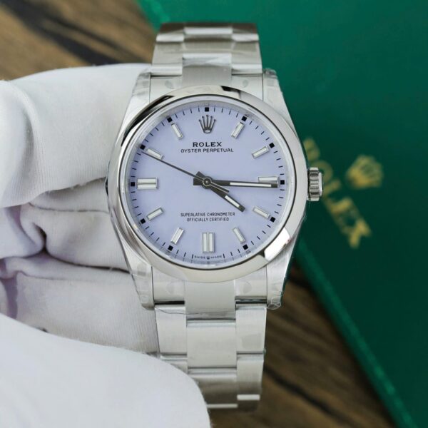
Rolex Oyster Perpetual 126000 Lavender Dial Automatic Movement VS Factory 36mm
$1,200.00 -
 Rolex Super Clone
Rolex Oyster Perpetual 41mm “Pistachio Green” Dial Smooth Bezel Oyster Bracelet (124300) DD3230 Movement
$1,200.00 -
-
Rolex Super Clone
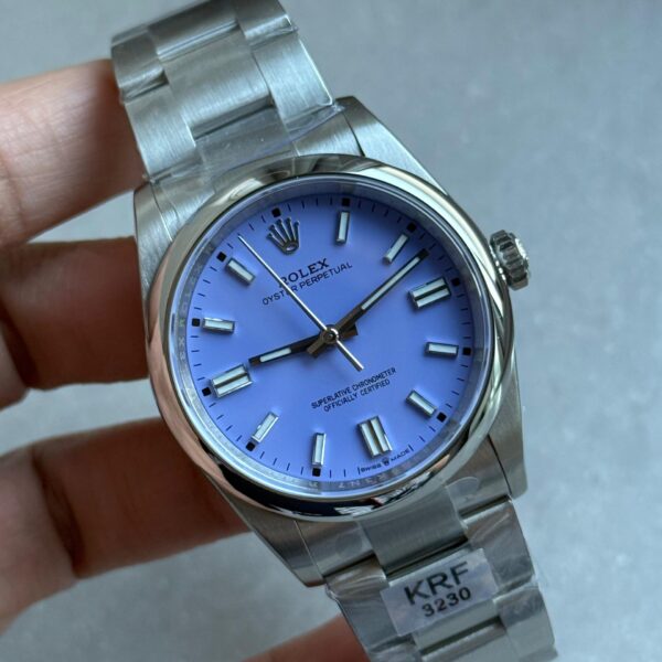
Oyster Perpetual 126000 36mm KRF 1:1 Best Edition 904L Steel Lavender Violett Dial A2824
$1,200.00 -
Oyster Perpetual
Rolex Super Clone Watch Oyster Perpetual Celebration Dial Clean Factory 36mm
$1,200.00 -
Oyster Perpetual
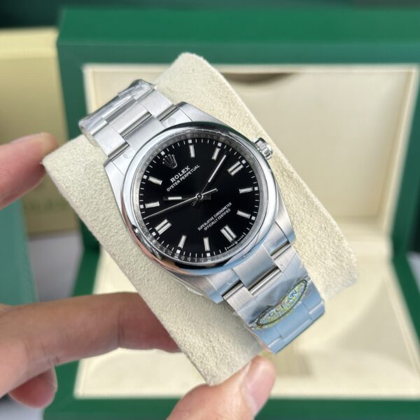
Rolex Super Clone Watch Oyster Perpetual 126000 Dial Black Clean Factory 36mm
$1,200.00 -
Oyster Perpetual
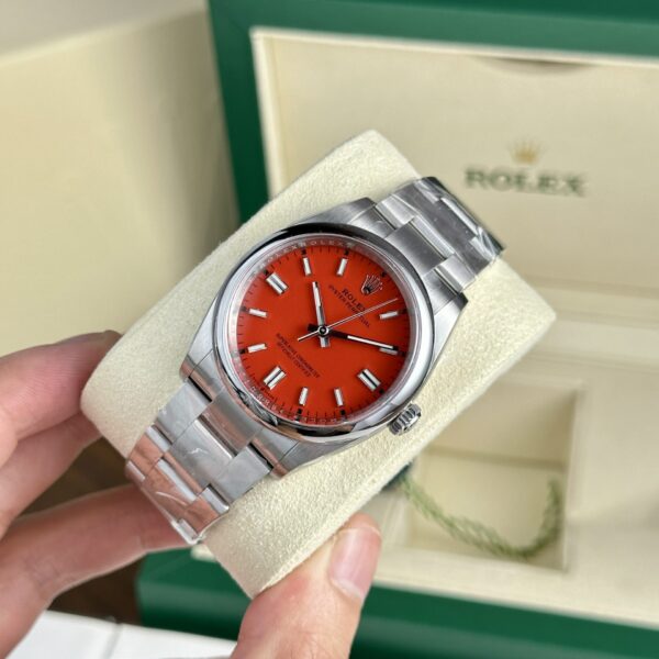
Rolex Super Clone Watch Oyster Perpetual 126000 Red Dial Clean Factory 36mm
$1,200.00 -
Oyster Perpetual
Rolex Super Clone Watch Oyster Perpetual 126000 Green Dial Clean Factory 36mm
$1,200.00 -
Oyster Perpetual
Rolex Super Clone Watch Oyster Perpetual 126000 Blue Dial Clean Fatory 36mm
$1,200.00 -
-
-
Rolex Super Clone
Rolex Clone Watch Oyster Perpetual 124300 Yellow Dial Clean Factory 41mm
$1,200.00 -
Oyster Perpetual
Rolex Super Clone Watch Oyster Perpetual 124300 Dial Blue Clean Factory 41mm
$1,200.00 -
Oyster Perpetual
Rolex Super Clone Watch Oyster Perpetual 124300 Silver Dial Clean Factory 41mm
$1,200.00 -
-
Oyster Perpetual
Rolex Oyster Perpetual 124300 Super Clone Watch Blue Dial King Factory 41mm
$1,200.00