
No products in the cart.
Blog
How to Read QC Photos Before Approval
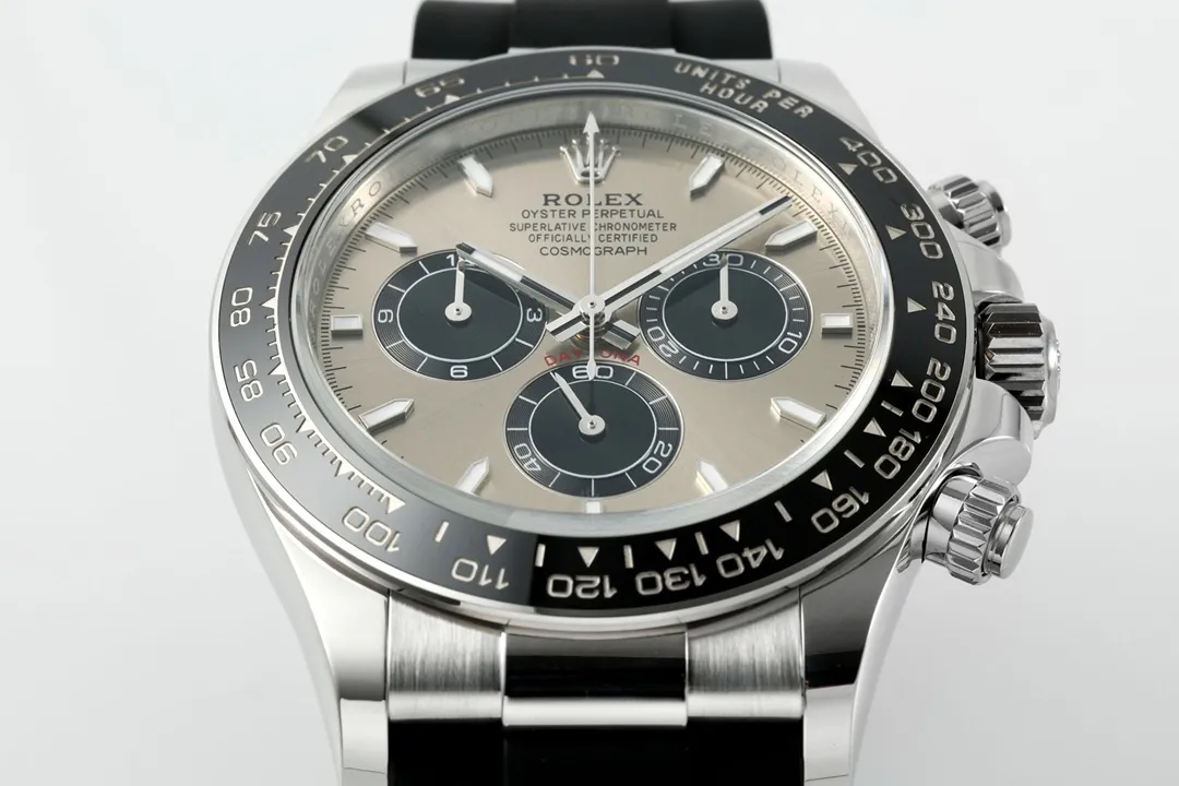
Approving QC photos fast is how people get burned.
They skim for a few seconds, see the logo where it should be, and hit approve. Then the watch lands, and suddenly every small misstep jumps out—because you’re finally seeing it in real life lighting, at normal viewing distance, from angles the photo never captured.
Most buyers aren’t careless. They just don’t know what to look for in the first place. Once you know the right checklist, QC photos stop feeling like guesswork and start feeling like evidence.
What QC Photos Are For (and What They Aren’t)
QC photos aren’t there to hype the listing. They’re there to document the exact piece you’re about to receive.
That’s the big difference. Marketing shots are usually the “best angle, best example” version. QC shots are supposed to show the actual watch—warts and all—so you can confirm the details that matter for wear, not the ones that look great in a staged picture.
So don’t treat QC photos like a product page. Treat them like a condition report.
If you want to understand what happens before those photos are sent, our guide to how we inspect watches before shipping goes through the wider pre-shipment QC process.
Zooming straight into the dial is a common trap. It feels productive, but it often makes you miss the real issues.
Take one step back and look at the watch as a whole. Does it look visually balanced? Is the bezel sitting the way it should? Does the bracelet look centered relative to the case? Anything jump out immediately?
Most problems don’t require a microscope. If the watch is off, you’ll usually see it without hunting for tiny flaws.
Bezel, Date and Dial Alignment
If you only verify one thing early, make it bezel alignment. It’s fast to check and usually obvious in QC images.
Compare the 12 o’clock bezel marker with the dial marker directly beneath it. Do they line up cleanly? If they don’t, you’ve got a misalignment that can stay noticeable every time you look at the watch.
Factories can be inconsistent sometimes. The good news is that this kind of issue shows up clearly in photos most of the time. If you want to see the different types of alignment problems worth paying attention to, the bezel alignment guide goes deeper into this specific check.
Date windows create more back-and-forth than almost anything else. Sometimes the date is truly mispositioned. Other times, buyers reject a watch over something that only shows up when you go way beyond normal viewing.
Look at where the date number sits inside the window. Is it centered, or does it drift left, right, high, or low? Then ask a simple question: would you notice it while wearing the watch, under everyday lighting, or only when you’re zooming in like you’re doing inspection work?
Normal wear beats extreme magnification.
It also helps to look at more than one number when possible. Different digits occupy the date window differently, which is covered in more detail in our date window alignment guide.
Dial markers are another place where QC photos can reveal a mismatch quickly—if you check the right spots.
Focus on the hour markers at 12 o’clock, 6 o’clock, and 9 o’clock. Those positions tend to make alignment issues easier to spot than random markers around the dial.
You’re not trying to measure. You’re checking whether the dial looks balanced when you view it like a person wearing a watch.
Crystal, Bracelet and Rehaut Details
Crystal quality affects how the dial color reads in photos. A crystal that handles reflections poorly can make dial color look washed out, too warm, too cool, or uneven—especially under harsh lighting.
Before blaming the dial, inspect how the crystal treats reflections. Can you see the dial clearly through the glare? Does the dial look hazy or cloudy? Any distortion where the reflection hits the dial?
Good crystals don’t keep stealing attention. They basically disappear. When the crystal is off, you feel it every time you look at the watch.
Dials get the spotlight. Bracelets do the real work.
QC photos usually show the bracelet well enough to catch obvious problems. Look for uneven gaps, clasp alignment issues, sloppy link finishing, and whether the bracelet sits centered to the case.
You won’t catch every micro flaw in a still image. But if something is visibly wrong, it’s usually visible here too.
We’ve also gone deeper into why bracelet quality matters more than most people think, because this is one area that becomes much more noticeable after the watch is actually on your wrist.
For many Rolex-style models, the rehaut engraving alignment gets scrutinized a lot. New buyers zoom until they find differences, then assume the watch is defective.
Skip the obsession and focus on obvious misalignment. If you need extreme zoom levels to prove something, it’s often not a real-world issue you’ll notice on the wrist.
Judge what you can see in normal viewing, not what you can hunt for at 400%.
QC Videos and the Magnification Trap
When a seller provides a QC video, don’t ignore it. Motion reveals problems that a photo hides.
Pay attention to hand movement, the date change, crown operation, bracelet flexibility, and how the clasp functions. If something looks clean in stills but behaves oddly in motion, that’s your cue to ask questions before approval.
Photos freeze one moment. Video shows whether the watch behaves the way it should.
Over-zooming is where approval decisions go off the rails. At extreme magnification, every watch—replica or real—starts showing imperfections that normal wear never exposes.
Tiny print differences. Minute marker shifts. Minor finishing inconsistencies. You zoom. You convince yourself it’s a big deal. Then you realize the “flaw” only exists because you’re staring at a screen instead of wearing the watch.
Stop zooming at a reasonable point. If the concern only appears at unnatural enlargement, it’s usually not worth losing sleep over.
Judge Against What That Factory and Model Typically Does
Not all factories finish the same way. Some are better with movement behavior. Others nail case finishing or bracelet build.
So QC photos should be compared to the standard you expect for that specific model from that specific source. If a dial color and crystal look slightly different than what you’ve seen in other examples, it might be normal variation for that build—not a defect.
Research helps here. Buyers who do better approvals usually know what “normal” looks like for their chosen factory and model before they review QC photos.
If names like VSF, Clean and BT are still starting to blur together, the VSF vs Clean vs BT factory comparison gives you a broader idea of why the expected strengths and weaknesses can differ.
After you’ve approved a few watches, you stop chasing tiny imperfections and start asking the questions that matter.
Does the watch look balanced at a glance? Is anything obviously wrong in bezel alignment, the date window, or marker alignment? Would the issue be noticeable when you’re actually wearing it? And does it match the expected quality for that factory/model?
Those answers beat microscopic perfection. At some point, you have to separate a genuine QC problem from something you would never notice without enlarging the photo.
Final Thoughts Before You Hit Approve
QC photos are your chance to inspect the exact watch before it leaves the seller. The risk is rushing. The fix is slowing down and checking the details that show up in daily wear.
Start broad. Then verify bezel alignment, date centering, and marker alignment. Inspect the crystal and reflections, because that’s where dial color can start looking “off.” Don’t forget the bracelet, and watch the QC video if it’s available.
When you do all that, you’re not trying to find a perfect replica. You’re making sure you won’t regret the watch the first week you wear it.